News
News Forums
 E-books
Autumn colours
We shall soon see the return of foliage strewn with garnet, gold and amber. But did you know that these shimmering colours, with their singular brilliance, illuminate the very first pages of one of the adventures of our favourite young hero?
In addition to seeing a newcomer – a very important one – arrive, The Crab with the Golden Claws stands out with a particularly colourful introduction.
The opus opens with a typical gag featuring Snowy. The action then continues in a picturesque district of Brussels, a stone's throw from where the young reporter lives. But what interests us above all, in these first pages, is not so much the content – that is to say, the narration – as the form – in other words, the setting. Hergé and his colourists skilfully coloured it.
The other "debate" about colour
In art as in science, there are philosophical subjects that make people angry. Especially when it comes to wondering if it's the design or the colour that counts. This thorny question, almost as insoluble as the well-known chicken-and-egg issue, has been the subject of much has been written and debated. Nicolas Poussin and Peter Paul Rubens, in their time, tried to answer it. They have so often clashed and lost their temper on this subject that art historians have ended up describing their verbal jousting as the "Debate about colour".
In 1936, Hergé and Charles Lesne (his editorial director at Casterman) engaged, in their own way - and to a lesser extent - in the same exercise. For the publishing professional - a Rubenist at heart, for obvious commercial reasons - it was clear that colour enhanced the appeal of the work. For this reason, he invited the young artist to adopt it without further delay. "As far as the pages of the books are concerned, it is essential [...] to go down a new path: that of colour", he wrote. But this was without taking into account the fact that Hergé was a Poussinist, in other words a fervent supporter of pure line. This was to be expected, since in his style - as he himself wrote in a letter in 1942 - "the line is the real skeleton".
The declaration of war temporarily ended the discussion, although the subject came up again quite quickly. In 1942, to be precise. It must also be said that Casterman, in the meantime, were very keen because they had just acquired: an offset press for four-colour printing. In fact, from this date on, things evolved, even if Hergé was still not convinced. The Crab with the Golden Claws would be the last adventure in the series to be released in black and white.
And even if he now had to deal with colour, the cartoonist continued not to compromise the clarity of his work. In fact, when he adopted it definitively, he took "the side of solid colours which (according to him) had the merit of simplicity and readability".
Coming through
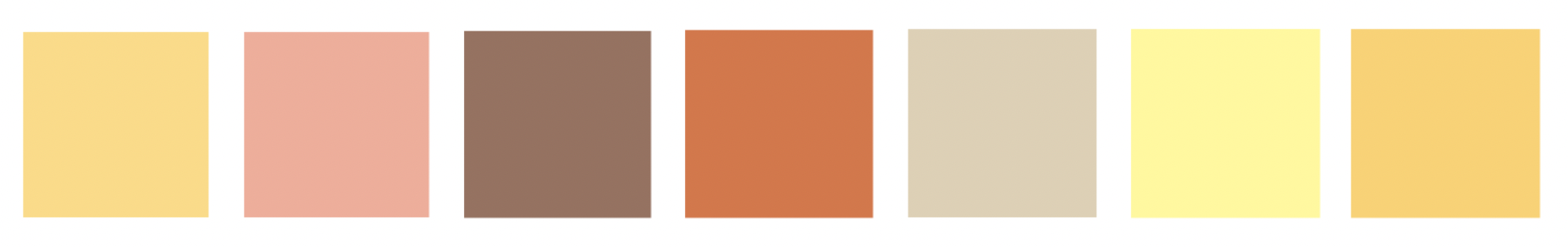
Sand, salmon, brown, brick, beige, straw and tangerine. These are the hues that dominate the backgrounds of the first seven pages of The Crab with the Golden Claws. This subtle colour palette was surely not chosen by chance. On the one hand because it evokes the reflections of the precious metal mentioned in the title; on the other hand, because it gave the first scenes of the adventure a bright and luminous atmosphere.
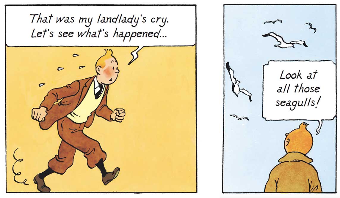
The reason why Hergé and his team took so much care in choosing their colours, was because they greatly influence the perception of the visual arts – that is to say, the artistically represented space that is given to the viewer to see. Moreover, there is a theory according to which the use of warm colours would visually bring the subject closer to the observer, whereas treated with cold colours, the same design would tend to move away from them. This is confirmed when two vignettes treated according to this process are opposed (see below). In the one on the left, the orange background conveys the proximity and warmth of the fireplace. In fact, a feeling of intimacy dominates. While in the one on the right, it is rather the effects of openness and depth that are sought through this light blue flat area. It is therefore a feeling of immensity that is expressed.
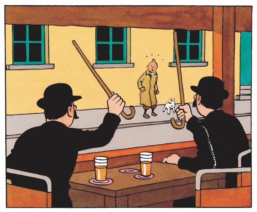
This principle of spatialisation also works very well by juxtaposing gradient tones. The scene where we discover the Thom(p)sons, quietly sitting on the terrace of a café, is an excellent example of this technique, called "atmospheric perspective". Shadowy tones are indeed used to characterise the elements in the foreground, while in the following ones, they are treated with more clarity and luminosity.
Also note that this harmonious shade of freshly squeezed oranges is subtly counterbalanced by the addition of a complementary colour. It’s worth noting here that some shades are so powerful and so strong visually that they are automatically more present. There is therefore no need to apply an equivalent amount of it to achieve chromatic balance. In fact, small touches are enough. In this case: the green-blue notes of the door, mullions and frames.
Setting the tone... and the right one!
Seven pages, seven colours... Good heavens, does this mean that Hergé and his team have used colour to emphasise the division of the action represented? It would indeed seem so, because each value is equivalent – roughly – to a given sequence.
And if we look even closer, we also see that it served as a rule of unity. However, the usual winning trio of "place – time – action" has given way here to another combo just as interesting. In this case: the magic formula "place – atmosphere – action". To do this, all they had to do was play with the symbolic language of colours. Each shade becomes the expression of a significant atmosphere.

As a result, when Tintin rescues and scolds Snowy, the jovial colour at the beginning immediately turns to salmon. In other words, a washed-out, very muted red (a tone often associated with danger and strong emotions). Then, through the intermediary of the Thom(p)sons, a new location appears. Since it is meant to be comfortable and welcoming, it is logically decked out in predominantly brown (a tone that evokes the simple, raw and natural aspect of certain materials, such as leather and wood, for example).
Then there's a quick trip to the Thom(p)son’s house. True to form, the Belgian policemen immediately turned the scene into absolute mayhem. The background turns brick red to convey the excitement. In fact, the confusion is such that the colour ends up unifying the entire set. The tones used in the sequence are so similar that it's difficult to distinguish the one reserved for their interiors from the one for the common areas of the building.
After a melange like that, you need to take a break. That's why a neutral hue accompanies the characters as they move about. Then, suddenly, there's a break. A clean break, in fact, because, very quickly, a bright yellow background comes into view. Appearing like a spotlight, it completely obscures the background, so that the silhouettes, gestures and expressions stand out very clearly. It's an effective way of highlighting the mysterious disappearance of the tin can found by Snowy five vignettes earlier.
Tintin then returns home to study the fragment of the label he found in the Thom(p)son’s house. Readers then discover an orange interior that suits their hero well, since it is simple, hushed and conducive to reflection (the colour orange is, in fact, synonymous with open-mindedness and creativity). So it's hardly surprising that, within his own walls, he discovers the clue that will lead him down a most interesting path.
That’s it, we have reached the end of this new dossier. The tintin.com team hopes that it has given you the opportunity to pick up – and learn, above all about colours. And of course, if you want to know more, don't hesitate to consult previous articles on the subject such as "What is your favorite color?"
Texts and pictures © Hergé / Tintinimaginatio - 2024