Hergé Explained: the Art of Color
When Hergé began the first adventures of Tintin in the late 1930s, the question of color had not yet arisen. The albums naturally appeared in black and white. And yes, new generations, surrounded by technology and color, can hardly imagine it today. In Hergé’s energetic era, printing techniques were expensive, war was looming, and paper was scarce.
Yet the world was slowly changing, despite stubborn resistance, much like Hergé himself… but more on that later. Magazines such as Bravo ! were now printed in full color. Young readers were getting used to it, their eyes growing more demanding, and competition was intensifying. Very soon, the absence of color in The Adventures of Tintin ceased to feel natural and became a boundary to cross. Publisher Louis Casterman realized this and pressed his author to take action. As you might guess, it turned out to be more complicated than expected.
In 1941, Louis Casterman paid Hergé a visit. The two men talked at length. They discussed reducing the number of pages, switching to color, and lightening the printing process. Casterman hoped to reach a broader audience while coping with paper shortages. But Hergé resisted, and with good reason. He feared that these material constraints would damage the quality of his storytelling and turn his work into a collection of mere anecdotes. Only after the growing success of Bravo ! and the prospect of wider distribution did he finally agree to take the leap.

In 1942, colorization became a colossal undertaking. For Hergé, it was not just a matter of adding shades; everything had to be rethought, from page layout and rhythm to composition and visual balance. Reducing the old albums to sixty-two pages required a complete overhaul of the lettering, the image format, and the coherence of each scene. While Casterman insisted, Hergé declared that he would need a proper studio to accomplish this new kind of work. It was around this time that he dreamed of collaborating with Edgar P. Jacobs, whose skill as a colorist deeply impressed him.
On February 9, 1942, the two men met at Casterman’s offices. Hergé was won over: they shared the same artistic references and the same pursuit of precision. Great minds always find each other in the end. Enthusiastic, Hergé wrote to Jacobs the very next day, already addressing him as “my dear friend” and imagining a full-time collaboration. But Jacobs, tied up with other commitments, eventually declined the offer. He could only dedicate three days a week to the retouching of the albums. Disappointed, Hergé realized he would have to adopt a more traditional, structured approach. He decided to hire several specialized artists, each responsible for a specific part of the work.
Despite this setback, the studio began to take shape. Hergé recruited, supervised, and watched over every line and every hue. As seen in a previous feature/dossier (The Secrets of Hergé Studios: Behind the Scenes of Tintin), the father of Tintin delegated but kept control of the essentials to meet his readers’ expectations. For him, color should never overpower drawing but rather serve it.
« No shadows, no chiaroscuro, » he wrote; the line must prevail over the tint, clarity over virtuosity. The influence of line drawing asserted itself. Hergé considered painterly techniques too impressionistic and preferred flat, solid color in the service of storytelling. His goal was to find the right balance between clarity and expression.

In his letters, Hergé remained cautious. Color, he insisted, must never betray the drawing. It should illuminate it, give it depth without overcomplicating it. With The Shooting Star, he finally reached that balance. The palette became soft and measured; every shade was chosen for readability. Soon, colorization became an opportunity for systematic reworking. Everything Hergé had begun in Het Laatste Nieuws expanded and took on new scope.
But such perfection came at a cost. Technical trials were numerous, and supervision constant. Among his collaborators were Alice Devos, hired on a trial basis and signing her work « A.D. », and her future husband José De Launoit, who also contributed occasionally to the studio.
Jacobs, Devos, and De Launoit each lent a hand in turn. Hergé oversaw everything, sometimes excessively. He wanted everything to be exact: « an airplane must be able to fly, a ship to sail, a car to drive. » Realism became his guiding principle, color his instrument of truth. The color albums, far from simplifying his work, only made it more complex. He now had to adjust tones, check print runs, and deal with the constraints of rationed paper.
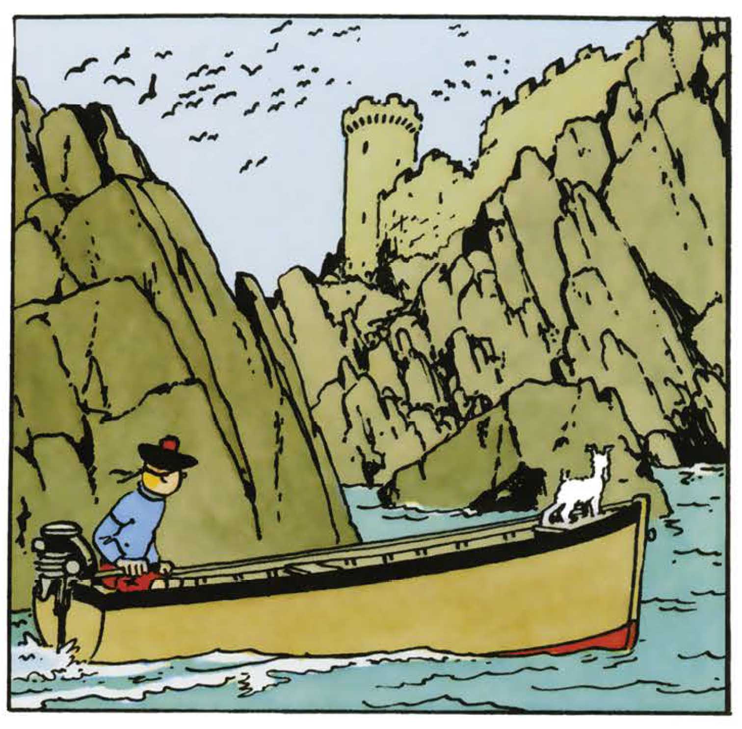
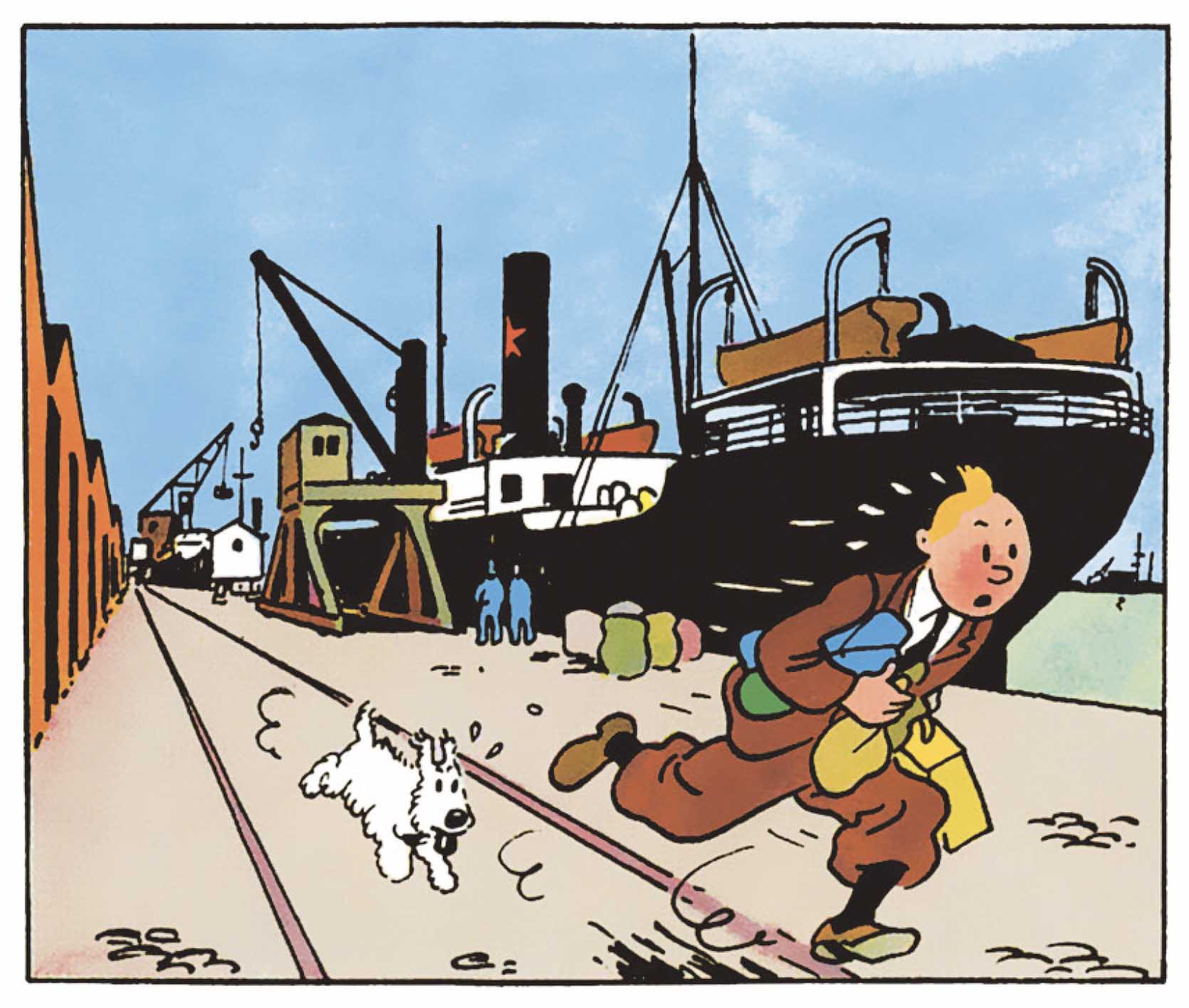
Meanwhile, success did not falter. The Crab with the Golden Claws, The Broken Ear, and The Black Island were met with great enthusiasm. Hergé declared himself « delighted » with the quality of the result, even though paper shortages prevented Casterman from meeting demand. The war slowed printing, but the publisher, ever pragmatic, was already thinking ahead. In a letter, he wrote, « We aim to be ready with six or seven albums at least by the end of the war, so we can launch into foreign markets. » Time proved him right: the move to color, achieved almost by force of will, became the sine qua non of Tintin’s worldwide success.

In truth, this transformation went far beyond technical progress. By embracing color, Hergé created a new visual language, the art of clarity and precision. Everything was ordered through the exactness of line and the balance of tone. Color was no longer decorative; it structured the story, clarified the narrative, and emphasized depth. Like in cinema, Hergé now composed by layers (foreground, background, and perspective) giving his stories greater density. The Secret of the Unicorn stands as proof: objects come to life, settings breathe, and the images grow richer without ever becoming cluttered.
By the end of the war, the wager had been won. Hergé had turned constraint into creative strength. What technique once imposed, he had transformed into an aesthetic. Color became, for him, the symbol of renewal, of clarity, rigor, and modernity. Tintin left the world of black and white to step, once and for all, into the light of color.
Texts and pictures © Hergé / Tintinimaginatio - 2025


 News
News Forums
 E-books

