News
News Forums
 E-books
The "Christmas bauble" effect
To round off the year in style, this month tintin.com focuses on a spectacular illustration by Hergé for the cover of the Belgian edition of Tintin magazine in December 1959.
In 1959, Tintin's creator was at the height of his powers. So, to celebrate the festive season in his own way, he embarked without hesitation on an arduous "stylistic exercise" that honoured an ancient Belgian pictorial tradition. Namely: the reflected image in the bauble.

It's Belgian!
The principle of the "image within the image" appeared for the first time in a 15th-century Flemish painting. The aim of this creative process was to broaden the viewer's field of vision by offering a point of view that was both complementary to and different from the subject depicted.
One of the most famous examples in the history of this art is a painting by Jan van Eyck in 1434 entitled The Arnolfini Portrait. Positioned above the centre of the composition, a circular convex mirror (at the time, technological advances had not yet made it possible to produce flat models) reflects the image of a young married couple holding hands. But it's a "distorted" image, or rather, a "reinterpreted" one, because if you look closely enough, you soon realise that behind the scenes does not quite correspond to the reality depicted. The dog (a symbol of loyalty) at their feet has disappeared, and the figures no longer have any physical contact with each other. It should be pointed out that, in Van Eyck's work, objects almost always have symbolic power. In fact, the mirror does not reflect the present, but rather the more or less near future. And therefore the harbinger of future marital infidelity.
Petrus Christus, a pupil of the master, also used this image in 1449, in a painting entitled A Goldsmith in His Workshop, but this time to give his work greater realism and depth. Like a link between two worlds, the mirror connects the pictorial space (the interior view of the shop) to the external environment (the street in which it is located), which cannot be represented because of the framing. This allows the viewer to see the faces of the two characters, who are in fact witnessing the same scene as themselves.
Hergé's approach was different. It was even more conceptual, in every sense of the word. Rather than sketching a real situation, he created a spectacular visual echo by playing on the direct perception... of an indirect theme. In this case, a virtual image (in the optical sense of the term) seen without double reading. In other words, his heroes are not "physically" present in the field but appear there all the same, via a reflection.
Making a circle around... Christmas
Understanding a reflected image is far from easy. Very often, a single glance is not enough to understand and appreciate all the subtleties. As an apostle of clarity, Hergé opted for a minimalist composition to sublimate the technical nature of his subject. It's so uncluttered that his "merry band" instantly grab the viewer's attention.
Of course, as this is an illustration for the cover, the design was first created to fit in within the technical constraints imposed. For this reason, the upper part is largely reserved for the cartouche containing the logo and information about the publication (title, date, price, etc.) as well as the words "Merry Christmas". The remaining space is devoted to the visual itself. The simple design is highly effective. It's based on just two main lines, but they complement and balance each other perfectly.
The first is the slant of the fir branch. By creating a dynamic in the upper part of the image, it acts as a natural bridge that invites the eye to glide from the title to the main image. The second is circular and static, so as to circumscribe and anchor the subject. It is strategically positioned two-thirds of the way through the image to draw the eye in.
Finally, the festive two-tone colour scheme, based on an effective complementary duo (in this case, a combination of green and red), introduces a shimmering contrast that definitely captures - and holds - attention. All the more so as it stands out against a dark, neutral background. Finally, the contrasting materials (the plant treated as a solid surface and the shiny surface of the bauble treated as a gradient) also help to give the subject depth. Proof that Hergé really did everything he could to ensure that the viewer was only looking at himself.
Professional deformities
Let's turn now to the specular treatment. This allowed Hergé to fit a group of five of his most illustrious characters onto a small surface without any problem. Because, like a convex mirror, the spherical shape "opens up" the angles and considerably widens the field of vision. As a result, the spectator can even perceive the boundaries of the room in which the heroes find themselves.
But more than the practical side of the thing, it's above all its aesthetic dimension that interests Hergé. Its visual impact is striking. To create the perfect illusion, he used a special spatial construction called spherical perspective. This graphic feat requires excellent technical mastery, since it is based not on two or three vanishing points, as in most cases, but on five (shown in yellow in the visual below). Obviously, as a skilled cartoonist, Hergé rose to the challenge with flying colours. What's more, the rendering is so realistic that it almost resembles the radial deformations obtained in photography using "very wide-angle" or "fish-eye" lenses.

Characters and objects placed close to the first vanishing point (placed in the centre of the composition) undergo a magnifying distortion, like the Captain's glass of champagne or the sheet of paper held by Tintin, for example. As for the elements further away, their shapes curve, like the skirting boards on the walls and the lines of the ceiling. It is precisely this combination of magnification and swirling, giving the scene its distinctive visual character. This type of effect creates an impression of depth and dynamism that would be impossible to achieve with traditional perspective.
Finally, it should be noted that while Hergé's aim here is to convey reality with high precision, the resulting distorted representation is very close to caricature. What's more, in terms of proportions, the characters have - graphically speaking - gone "over the top". It's a comic effect that goes hand in hand with the joyous spirit of the festive season.
Face, my beautiful face!
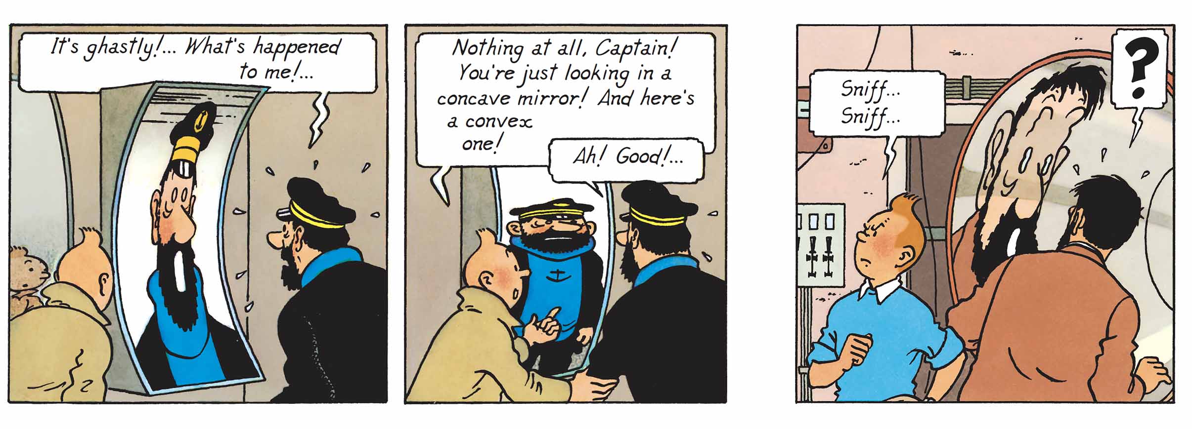
Before concluding this dossier, let's not forget that Hergé had already tried his hand at this exercise in 1944, in Red Rackham’s Treasure, when Tintin and Haddock went into a bric-a-brac shop to buy diving equipment. The owner of the shop obviously had a good look at them before he started to decipher the Captain's face. “What's so extraordinary about it?” he says in return, before coming across a find that immediately exaggerates his face.
Twelve years later, Hergé repeated the experiment in The Calculus Affair. But this time it was the shade of a state-of-the-art acoustic instrument that acted as a distorting mirror. Although amusing, the scene above all underlines the perplexity of the two accomplices. Here, they're trying to "unravel the mystery of all this broken glass", as Tintin puts it (quote from illustration Plate 6, vignette D3). And guess who plays the mirror game? The Captain, of course. That's normal, since his face is more expressive than that of his young accomplice, and therefore more amenable to distortion. Proof that when it comes to entertaining the gallery, the grumpy sailor definitely has the head for the job!
That's it, this month's analysis is over. The tintin.com team wishes you all a happy festive season!
Texts and pictures: © Hergé / Tintinimaginatio - 2024