


 News
News Forums
 E-books
Cutting-edge double-page spreads!
In Hergé's work, there is only one cover page separating fiction from reality. Very early on, the creator of Tintin exploited the blank space between the story and the cover to turn it into a narrative threshold. A place where the adventure is already taking shape and where the reader gradually becomes immersed.
As an introduction, he first decided to show his young hero in various poses and situations, taken or freely inspired by his early adventures, before creating a gallery of 141 portraits in 1958. This new version accurately reflects the continuity, but above all the extraordinary expansion, of his body of work.
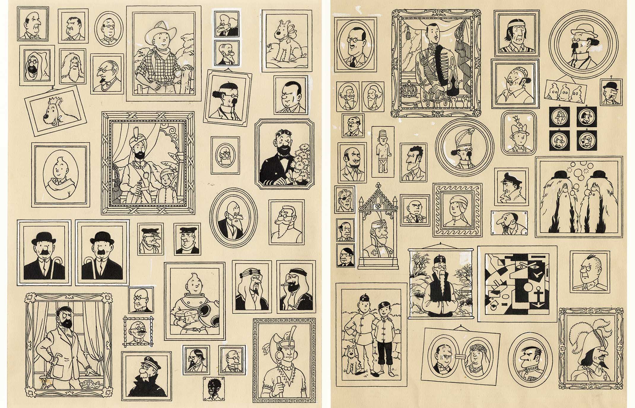
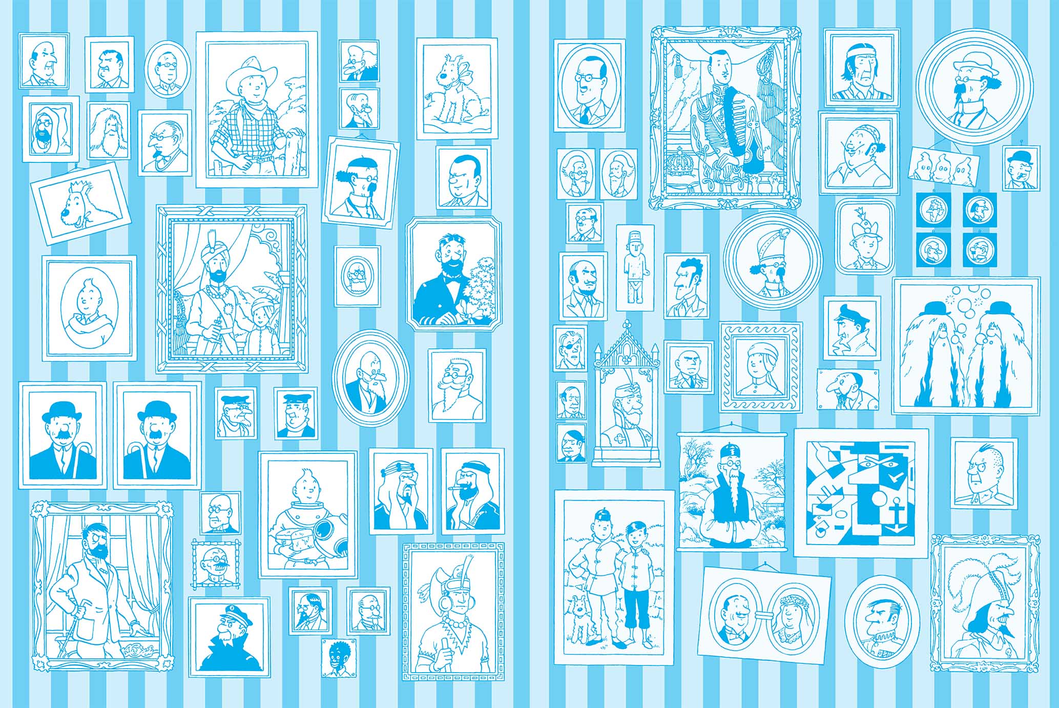
From the moment it appeared in the books, this two-part photo gallery contributed to the legend of The Adventures of Tintin. It quickly became one of the most important visual signatures of the work. And if it is so powerful and impactful, it is largely thanks to its monochromatic treatment. In this case, a subtle shade of blue (a tone which, incidentally, resembles... one hundred per cyan... euh cent, one of the three primary colours used in printing). So much so that after “Klein blue”, it would be natural and appropriate to talk about “Tintin blue”.
It is clear that this shade was not chosen at random. It is soft, neutral and poetic. In fact, it does not interfere in any way, neither with the colours of the illustration plates it covers nor with the solemn hanging it accompanies. It acts as a visual transition between the concrete reality of the book and the narrative it contains, but also as a graphic respite between two portraits. Its cool nature spontaneously introduces a sense of depth and spatiality. Just what was needed to lighten this heavily laden composition.
And lightness was needed to air out this abundant ensemble, because the scenography imagined by Hergé was inspired by ‘Petersburg’ displays (this term echoes the presentation style practised by the Hermitage Museum in Saint Petersburg, which quickly became the hallmark of this institution) – in other words: a jumbled presentation that gives an impression of overload and apparent chaos, when in fact it is part of an overall visual harmony, where the overall effect takes precedence over the individual work. This is a particularly significant approach that – unknowingly – plays on both form and content. For without the strength of the collective, what would Tintin and his adventures be?
Hergé has brought together his protagonists here for posterity – whether they are major or minor characters, but also... good, bad or ugly. There is no distinction whatsoever. Everyone has their place in this impressive ‘trophy room’ that resembles a family album – an album that Zola and his Rougon-Macquart characters would not have been ashamed to see.
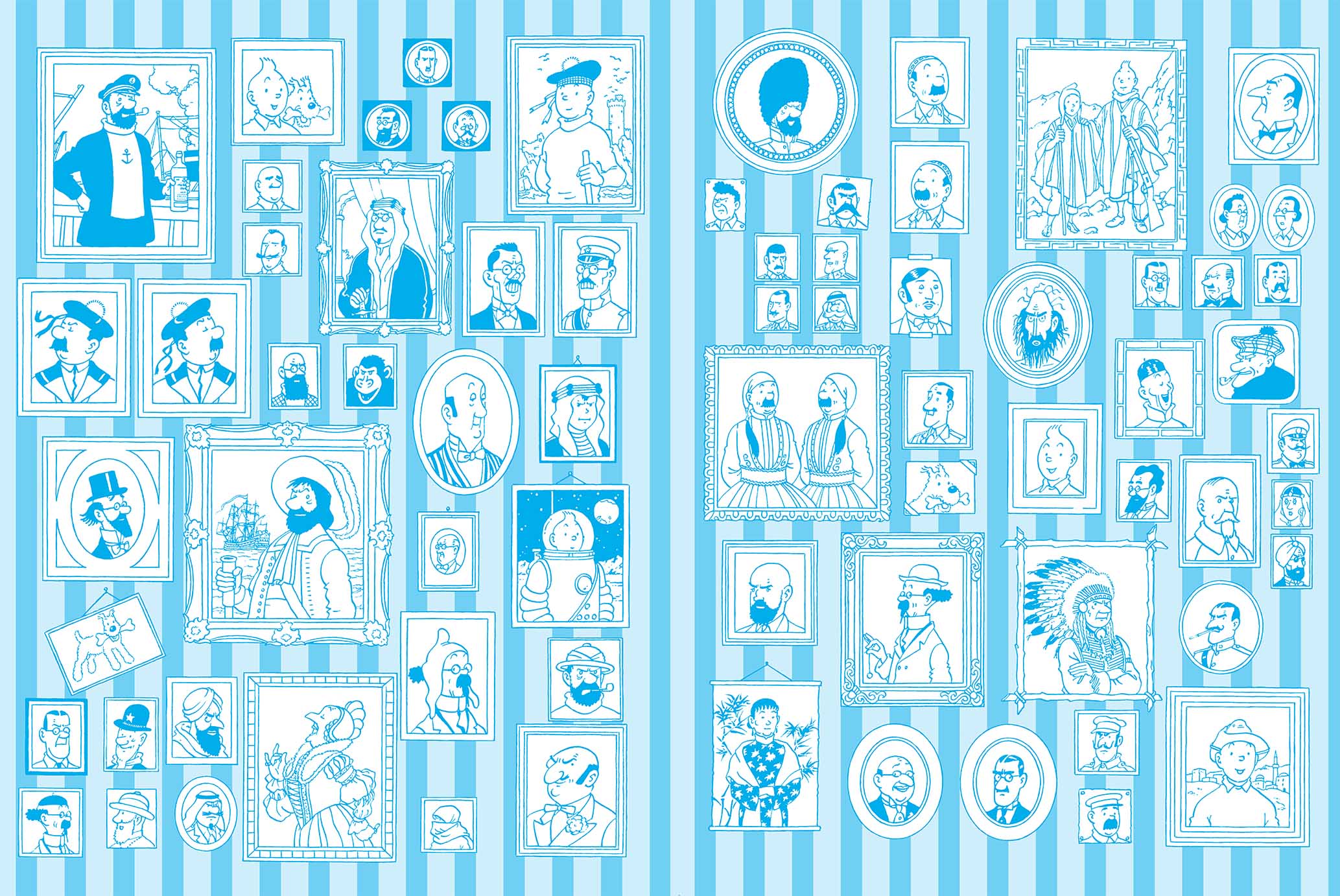
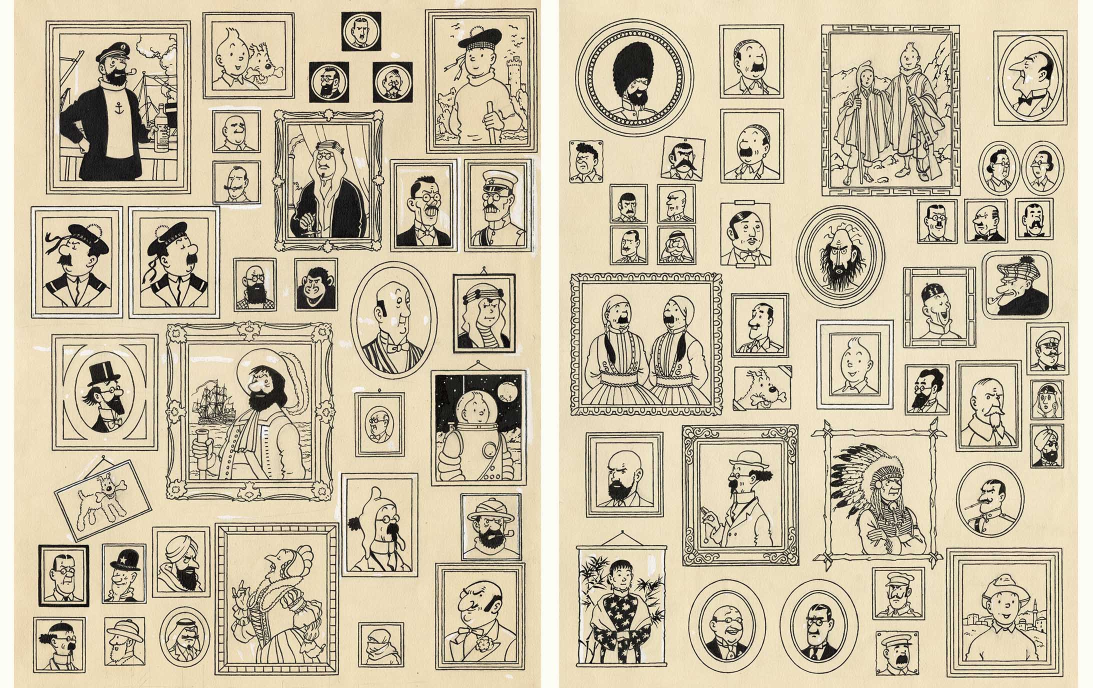
In short, his heroes cut a fine figure and they blend into the background. And that's putting it mildly. To prevent his heroes' portraits from appearing to float or levitate, Hergé came up with a simple but devilishly effective trick: strips of wallpaper subtly punctuated by alternating bands of varying thicknesses.
By opting for this solution, Hergé echoes another tradition – an even older one this time – which researcher and librarian Françoise Le Bouar discusses in an article entitled ‘Dans le secret des pages de garde’ (In the secret of the endpapers) (in La revue des livres pour enfant no. 191, February 2000): "The history of endpapers is intertwined with that of “wallpaper” until the second half of the 18th century, when wallpaper ceased to be the exclusive domain of tapestry makers and was manufactured for the sole purpose of covering walls. (...) At the source (editor's note: implied meaning: endpapers), we find this sheet of paper called “domino*”, whose ambiguous etymology indicates the meaning of “cap, mask, envelope”.
* Decorative backing – often marbled or decorated with floral and/or geometric patterns – covering the covers of old bindings.
Ultimately, with their rich graphics, transitional function and subtle resonance with centuries-old traditions, Hergé's endpapers cannot be reduced to mere decorative embellishments. They are certainly part of an ancient tradition, but they demonstrate a new inventiveness and coherence. It is precisely this dialogue between heritage and breaking away from tradition that gives them their elegant modernity.
Texts and images © Hergé / Tintinimaginatio - 2025


